New Look and I Hate HTML
Labels: here and there
Sunday, November 22, 2009
Need I say more? Especially when I'm technically challenged.
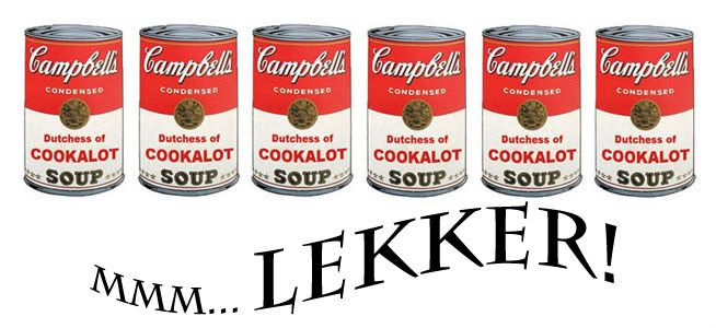
Out of vanity and boredom, I'd been contemplating on giving Lekker! a face-lift. But try as I might, I could not seem to find the heart to get rid of the nutrition label for a side-bar - it's so apt and cheeky for a food blog, don't you think? Then I couldn't bear to give up the iconic Campbell Soup can either. Nor the blinding red background. You get the drift.
Sigh.
So instead of a complete over-haul, I made a couple of changes here and there. Most noticeably would be the header which was done on Photoshop. I had a giggle over it. Can you tell why?
I got rid of the vanilla background on which the text is written on and went for classic white instead. Also messed around with the border and line separator for a more snazzy look. This would have taken an expert under an hour to complete but I'm not that expert. I'd forgotten what was what so everything went through the good old trial and error.
I like the new look. It reflects the two most important characteristics about this blog - tongue-in-cheek humour and a sense of fun.
Oh, and I still hate HTML.
The Dutchess of Cookalot whipped this up at 3:45 pm


